

|
Forms - Overview |
|
iLeap Platform’s Form Designer is 100% web-based and provides a simplified way to create and manage forms, by using an intuitive drag and drop interface. Here, you can design forms, maintain form templates, define a form’s business logic, make changes, and preview forms. You can build or design your forms in minutes choosing from a wide & comprehensive range of controls to input & associate them to the processes in a structured way. Forms designed using Form Designer are used in the Process Composer, either in conjunction with a Human Task Activity or at the Process level - when human intervention is required to start a process. |
|

| Contents |
Form Types
|
iLeap allows you to create a variety of forms that can suite to your diversified requirements. You can create the following form types. |
Default Form
| The default form is a blank canvas on which you can drag and drop controls from the panel on the left. Layout definitions are made for each row. If you do not define a layout, the row defaults to a single-column layout. |
|
Layout for a row can be changed even after a control is placed in it too!. |
 Tip:
Tip:Transaction Model Form
|
A Transaction model form is based on the transaction model defined in the Data Model. Typically, transaction model holds the transactional data that support the on-going operations of an organization. The transactional data supports the daily operations of an organization (i.e. describes business events). To know more, see Creating a Transaction Model Form. |
Master Model Form
|
A Master model form is based on the master model defined in the Data Model. You can use this form type to build master model forms to input the master model data. |

| Contents |
Custom Form
|
Custom Forms can be of two types: JavaScript Plugins - that work as forms - handling custom UI, custom validations or external data. You can build plugins using the templates provided at <location>. Different types of plugins are required for different Form Usages. Plugins should also be deployed at the same location where you picked up the template. Web Application URLs - developed using any web technology - but conforming to the standards provided at <location>. Different types of plugins are required for different Form usages. See Creating a new Custom Form. For guidelines on developing trigger custom form & action custom form, see Guidelines. |
| Previous
<< Form Types |
Back to Contents | Next |
Creating a new Master Model Form
|
Scenario: In order to design and develop the sample Travel Requisition Process App using iLeap, we first need to create or design the following master model form.
For the sequence of steps related to the sample 'Travel Requisition Approval' Process, see Process Flow. For detailed information on developing the sample Travel Requisition Approval Process App, see Sample Example Scenario. |
|
To create a new Master Model Form, follow these steps: |
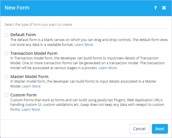
1. On the Forms tab, click Create Form.

2. The New Form dialog box appears.
3. Select the type of form you wish to create. Click Master Model Form.
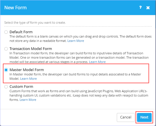
4. Click Next. The following dialog box appears.
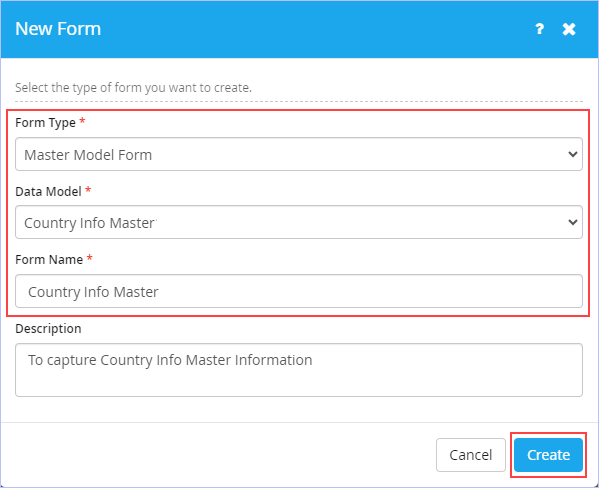
- Select the name of the data model from the Data Model list. For example, Country Info Master. Only published data models are displayed in this list and it appears only, if the selected Form Type is either Transaction Model Form or Master Model Form.
-
Enter the name of the form in the Form Name box. Ensure to key in a unique form name. For example, Country Info Master.
- Enter an appropriate description for the new form to be created in the Description box.
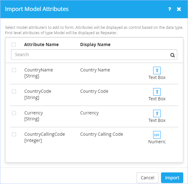
5. Click Create. The following Import Model Attributes dialog box appears.
- Click to select the required model attributes you want to add to the form. Else, click Attribute Name check box to select all the attributes at once to add to the form. You can scroll down to view all the displayed attributes before importing them to the form. Here, we import only those attributes that are absolutely required for the Country Info Master Form. The remaining attributes can be imported in their respective associated forms as appropriate at a later time.
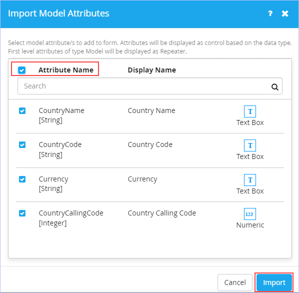
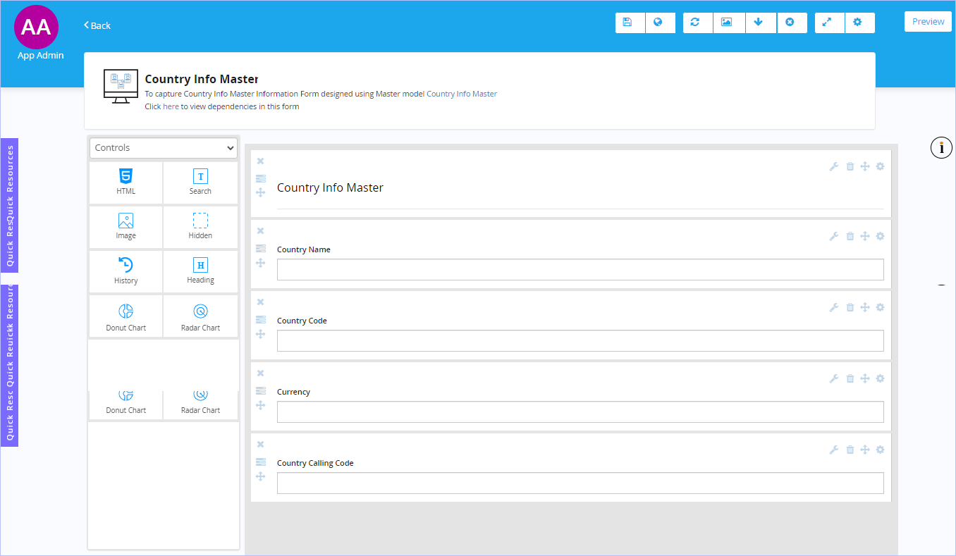
6. Click Import. On the successful import, the following page appears. Observe that all the imported attributes associated with the data model ' Country Info Master' are displayed in the right side canvas area as shown.
7. Click the  icon on the toolbar to Save this form. Immediately, 'Success! Form published successfully' message appears. For more information on the options available on the toolbar, see Toolbar options.
- If you choose to Save and Publish your form at once, the following Confirmation dialog box appears.

- Click Yes if you wish to start inserting data into your new form right away. Else, click No. You can enter the data into your master model form anytime later too.
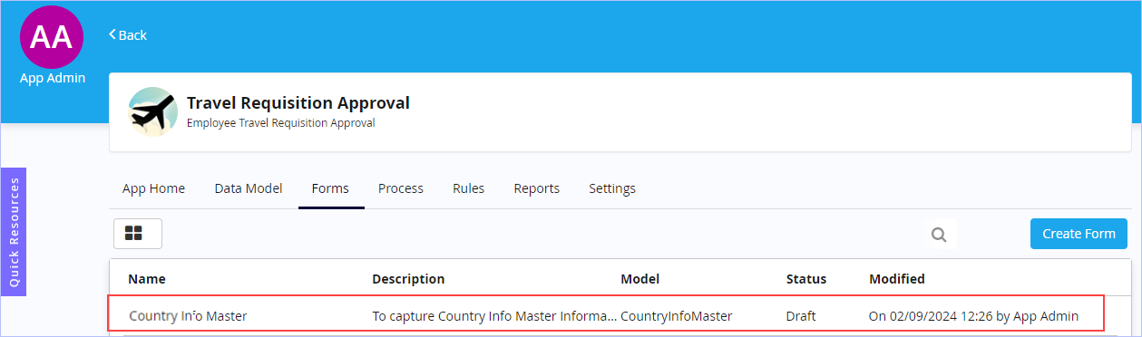
8. If you have chosen to save only, click Back at the top left side of this page to navigate to the previous screen to view the newly created master form along with its details in draft mode. Alternatively, you can navigate back to the previous screen on your web browser & view the same.
To insert data into your newly created master model based form, see entering master model data.
|
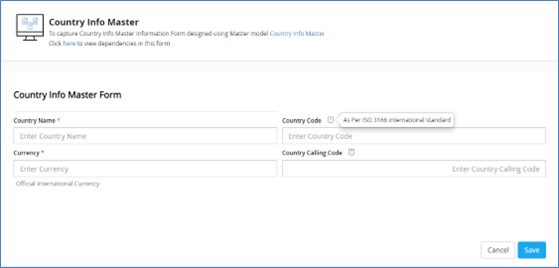
Once the master model form is created, you can design your form as per your requirements. Preview of the sample 'Country Info Master' master model form designed in Form Designer is shown below. |
|
|
 Note:
Note:
| Previous
<< Custom Form |
Back to Contents | Next |
Forms Design or Listing Area
|
This is the primary area that appears as soon as you choose to create and design any type of form. With the availability of comprehensive list of form controls along with the flexible WYSIWYG editor, you can create rich, interactive, & visually appealing browser-based forms with the ease of drag and drop feature. You can make use of the single window to set the properties of each form control be it related to form control's appearance, display, validation, data source, conditions etc. From the left pane, you can simply drag and drop any of the comprehensive list of form controls including multiple design layouts onto the canvas or form design area on the right to design your rich forms in a fast and easy way as per your business needs. You can also display your designed forms in either List View or Tile View. You can switch or toggle between any of these views any time. |
| To toggle between the displays of your forms, follow these steps: |
- On the Forms tab, click
 .
.
List View:
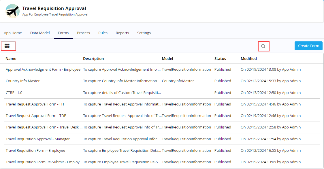
Tile View:
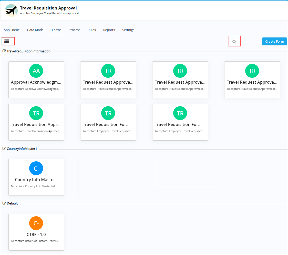
- In the Tile View, hover the mouse pointer on any form to view as well as access its related features similar to List View.
List of comprehensive Form Controls available for designing Default Forms:
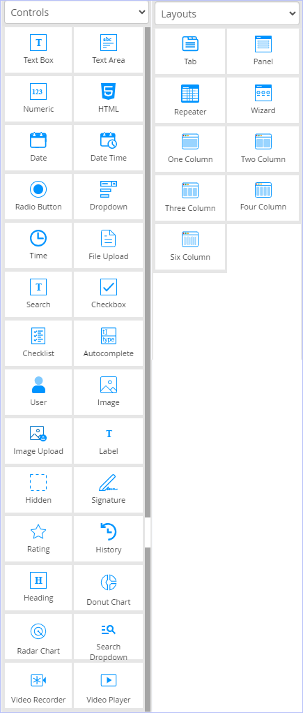
For detailed description on each of the form controls available in the form designer, see Form Controls.
Changing the Layout of the Form Control:
To change or modify the layout of the form control on the fly, click  & choose any of the available column layouts on the shortcut menu displayed. See, Layouts.

- Use the
 icon to drag & drop any form control to a blank column layout.
 - Click
 to delete the control from the layout. You can delete any form control in the form designer only, if the form is in draft or editable state. Once the form is published, you cannot do so.
Changing the Form Control Type:
Form Designer allows you change the type of form control at any time on the fly with just a single click (for example, from text box to Drop-down) on the desired form control's  icon.
icon.
- Click the icon which appears on the far right side of the form control selected, Comments (a Text Area control) as shown. From the shortcut menu, click to select any of the other type of form controls displayed.

| Notice that all the other available form controls you can use to change or modify this Text Area form control to are displayed on the shortcut menu. This display of form controls change accordingly based on the form control you select to set or modify. |
| Previous | Back to Contents | Next |
Form Controls
The table below details each of the form controls available to design your forms in the Form Designer.
| Control Name | Description | |
| Controls | ||
 Text Box |
An input field that allows users to specify text input. | |
 Text Area |
A text box is an input field that allows users to specify multiple lines of text input. | |
 Numeric |
An input field where users can specify numeric data. Use this control if you’re going to perform arithmetic operations on the user inputs. | |
 HTML |
Use this form control to display the html content. | |
 Date |
An input field where users can specify a date by selecting from a calendar. | |
 Date Time |
Use this input field when you want to allow the user to select a date and time, and to display that date and time in the specified format. | |
 Radio Button |
An input field where users can specify a single input by selecting from a predefined list of options. Similar to Drop down, but preferred if you have a short list of options. |
|
 Dropdown |
An input field where users can specify a single input by selecting from a predefined list of options. Similar to Radio Button, but preferred if you have a long list of options. |
|
 Time |
An input field where users can specify a time by selecting from a digital clock interface. | |
 File Upload |
Use this input field when you want to allow the user to select a file to upload through the form.
|
|
 Search |
Use this control to execute search functions. | |
 Check Box |
An input field where users can 'Switch ON' or Switch OFF' an option, by selecting or deselecting this box. |
|
 Check List |
An input field where users can specify more than one input at a time by selecting from a predefined list of options. |
|
Autocomplete |
Use this form control to display a drop-down list of pre-defined options or suggestions for your users as they input data. The drop-down list displays suggestions relevant to what the user keys in making the data entry faster & easier. Whenever the user types the first one or two characters of a word, this control displays the suggested words that begin with those characters. |
|
User |
This is a read only control for form users that displays the user name of the currently signed in user. | |
 Image |
This is a read only control for form users that allows you to display an image. | |
 Image Upload |
Use this form control to upload an image at run time. | |
 Label |
This is a read only control for form users that allows you to display text. |
|
 Hidden |
This control allows you to store the hidden values inside the form. |
|
 Signature |
Use this control to display the digitized signature (scanned image) of the process users in associated forms. |
|
 Rating |
Use this form control to allow users to indicate their interest in content. This control uses a set of visual icons to represent user interest & vary in size. |
|
 History |
Use this form control to display the history of the form. | |
 Heading |
Input field where user can enter display text within the form. | |

Donut Chart |
Use this form control to display the Donut chart. | |

Radar Chart |
Use this form control to display the Radar chart. | |
Search Dropdown |
Use this form control to provide searchable dropdown. | |
 Video Recorder |
Use this field where user can record and playback video within the form. | |
Video Player |
Use this field where user can playback video within the form. | |
| Layouts | ||
|
|
Tabs are used to logically group controls in a form, but provide better utilization of horizontal space as compared to a Panel Layout. There can be up to 10 tabs in a single Tab Layout. You can insert a Layout in a Tab, but not vice versa. | |
 Panel |
Panels are used to logically group controls in a form, but provide better utilization of vertical space as compared to a Tab Layout. You can insert a Layout in a Panel, but not vice versa. | |
 Repeater |
This form layout control is used to create a predefined row of controls to collect multiple inputs from the user. While using the Form, users can add as many rows as required. A numeric column in the grid can also be used to perform simple arithmetic operations to provide summary data for that column. This control is unavailable for forms you wish to create based on Transaction Model & Master Model. | |
 Wizard |
Use this form layout control or design pattern to provide guided navigation inside a form. It represents a multi-step form showing one step at a time. Use this design if you wish to show a single form in various pages as required. | |
 One Column |
Entire row in the form is treated as a single column. Allows placement of a single control in the column. | |
 Two Column |
A row in the form is split into two columns. Allows placement of up to two controls in the column. One or more columns can be left blank, if required. |
|
 Three Column |
A row in the form is split into three columns. Allows placement of up to three controls in the column. One or more columns can be left blank, if required. | |
 Four Column |
A row in the form is split into four columns. Allows placement of up to four controls in the column. One or more columns can be left blank, if required. | |
 Six Column |
A row in the form is split into six columns. Allows placement of up to six controls in the column. One or more columns can be left blank, if required. |
|
|
Few Form Controls do not appear on the left pane of the Form Designer, if you choose to design your form based on Transaction Model Form & Master Model Form like they do for Default Forms. However, they are available on the form control properties shortcut menu that appears when you wish to modify the type of the selected form control to any other type. |
| Previous | Back to Contents | Next |
Editing a Master Model Form
|
You can edit a Master Model Form at any time even after its publication as well. |
| To edit a Master Model Form, follow these steps: |
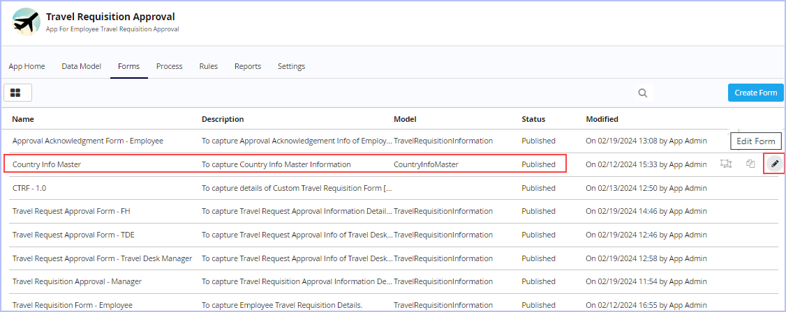
1. On the Forms tab, hover the mouse pointer on any published master model form & click  . Alternatively, open any published master model form you wish to edit & click
  on the toolbar to edit it.
2. Make the requisite modifications & then save or publish the form as needed.
| Previous | Back to Contents | Next |
Deleting a Master Model Form
Any form once published cannot be deleted. However, it can only be deleted in its draft or editable state before being published.
| To delete a Master Model Form, follow these steps: |
1. Hover on any unpublished form (in draft state) you wish to delete. Click theicon to discard it.
2. A confirmation message prompts you to choose an option between Yes or No to delete the draft version. Click Yes. On successful deletion, "Success! Form deleted successfully." message appears.
| Previous | Back to Contents | Next |
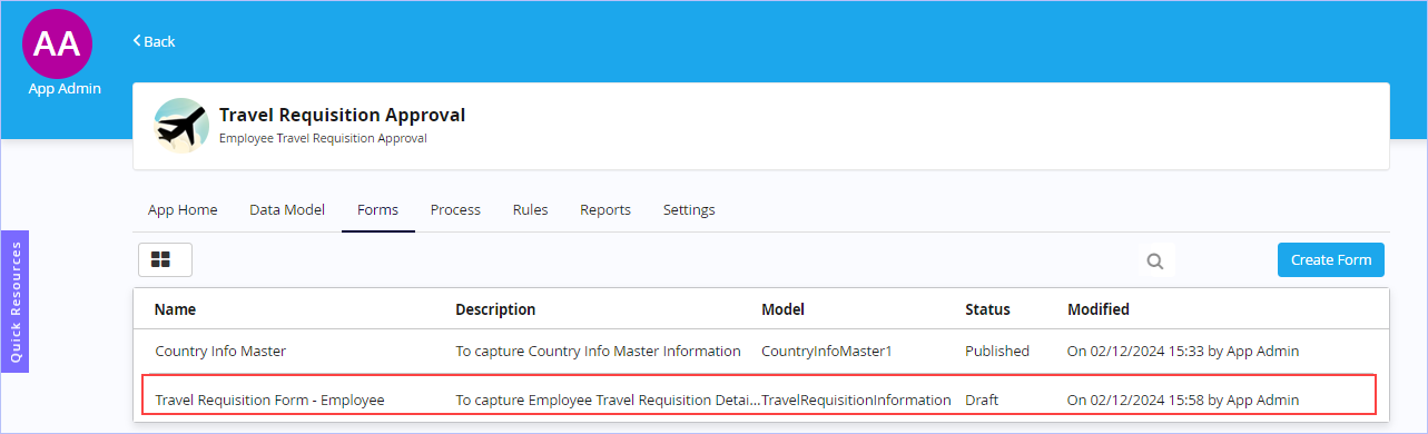
Creating a new Transaction Model Form
| You can use this form type to build forms to input and view details of transaction model(s). One or more transaction forms can be generated based on a transaction model.
Scenario: For the ease of understanding, let us consider creating a new trigger form based on the 'Travel Requisition Approval' example scenario which was illustrated earlier. However, you can directly create any new form without any defined data model as well (by choosing the 'Default Form' option). As per the Travel Requisition Approval process flow, we need to create or design the following new forms for the 'Travel Requisition Approval' sample App scenario. They are listed below. For the sequence of steps related to the sample 'Travel Requisition Approval' Process, see Process Flow.
Here, we will discuss creating the key or parent trigger form namely 'Travel Requisition Form' of employee for illustrative purposes. The steps for creating the other requisite action forms are similar to the one detailed for the trigger form 'Travel Requisition Form'. |
| To create a new Transaction Model Form, follow these steps: |
1. On the Forms tab, click Create Form.
2. The New Form dialog box appears.
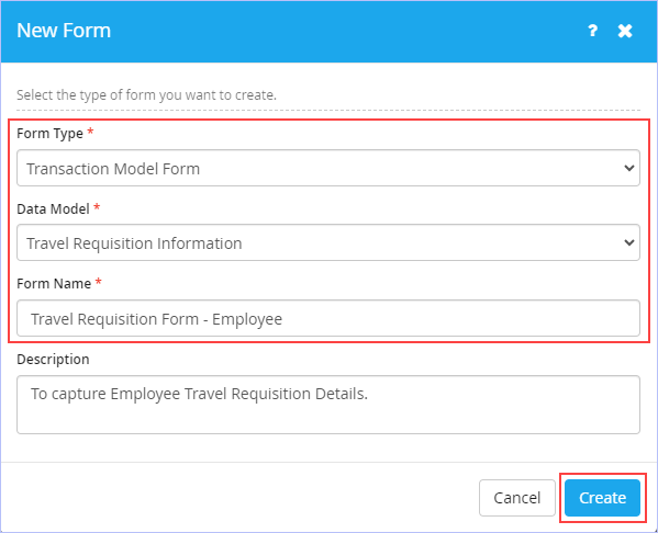
3. Select the type of form you wish to create. Click Transaction Model Form.
4. Click Next. The following dialog box appears.
- Select the name of the data model from the Data Model list. For example, Travel Requisition Information. Only published data models are displayed in this list and it appears only, if the selected Form Type is either Transaction Model Form or Master Model Form.
-
Enter the name of the form in the Form Name box. Ensure to key in a unique form name. For example, Travel Requisition Form - Employee.
- Enter an appropriate description for the new form to be created in the Description box.
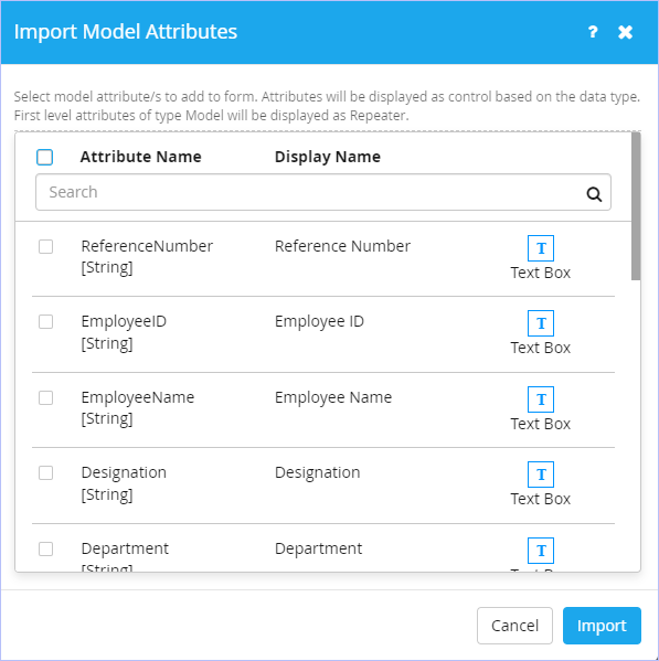
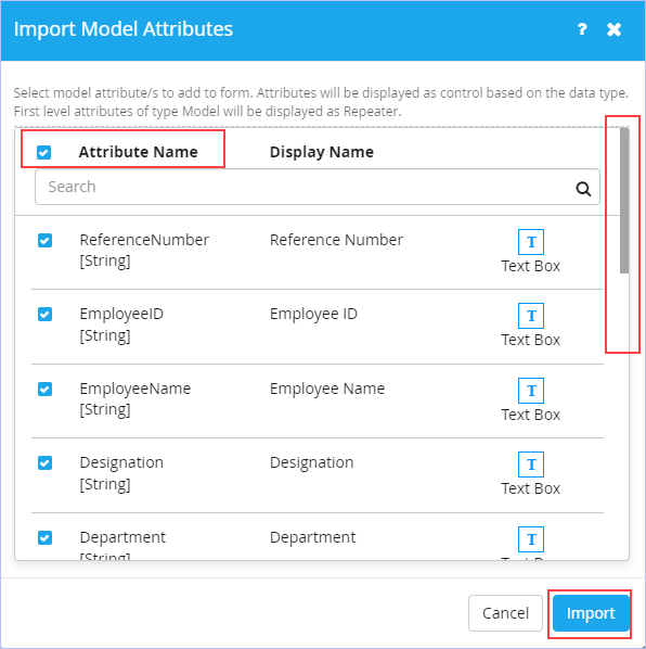
5. Click Create. The following Import Model Attributes dialog box appears.
- Click to select the required model attributes you want to add to the form. Else, click Attribute Name check box to select all the attributes at once to add to the form. You can scroll down to view all the displayed attributes before importing them to the form. Here, we import only those attributes that are absolutely required for the 'Travel Requisition Form - Employee' Form. The remaining attributes are imported in their respective associated forms as appropriate at a later time.
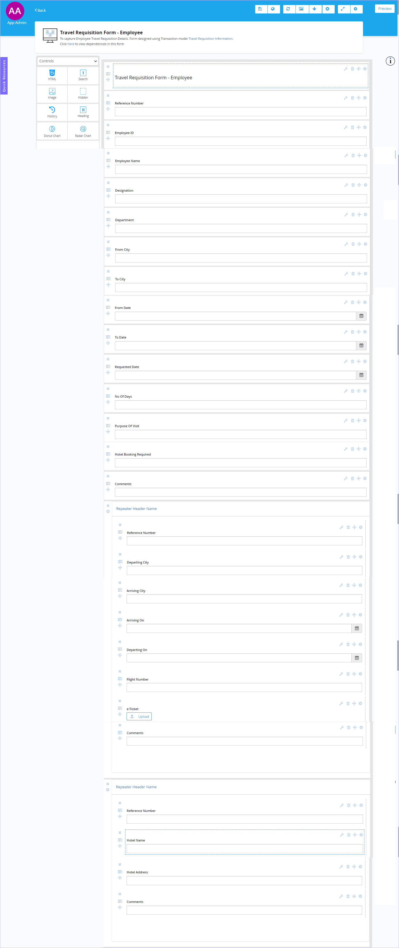
6. Click Import. On the successful import, the following page appears. Observe that all the imported attributes associated with the data model 'Travel Requisition Form - Employee' are displayed in the right side canvas area as shown.
7. Click the  icon on the toolbar to Save this form. Immediately, "Success! Form published successfully" message appears. For more information on the options available on the toolbar, see Toolbar options.
- If you choose to Save and Publish your form at once, the following Confirmation dialog box appears.

- Click Yes if you wish to proceed creating a process. Else, click No. You can create a Process anytime later as well.
8. If you have chosen to save only, click Back at the top left side of this page to navigate to the previous screen to view the newly created master form along with its details in draft mode. Alternatively, you can navigate back to the previous screen on your web browser & view the same.
|
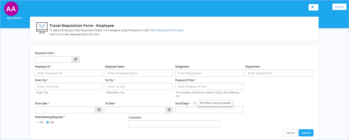
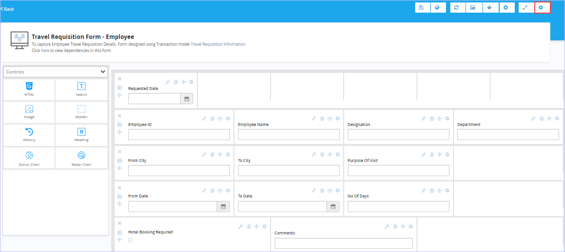
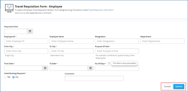
Once the transaction model form is created, you can design your form as per your requirements. Preview of the sample transaction model form 'Travel Requisition Form - Employee' designed using Form Designer is shown below.
|
|
|
| Previous | Back to Contents | Next |
Setting Form Control Properties
|
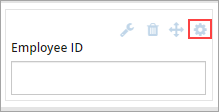
Form Designer allows you to easily set or modify the various form control properties such as appearance, display, validation, data source & conditions through a single dialog box. In this section, we will explore setting up properties of some of the comprehensive list of controls the Form Designer provides to design your forms, in a bit more detail. We will consider the following sample 'Travel Requisition Form - Employee' (a transaction model form) designed using the Form Designer as an example to illustrate setting up properties of some of the form controls used in this form (such as text box & radio button) in detail. |

| To set or change properties of a selected form control, follow these steps: (in this case, a Text Box control) |
1. Click the icon which appears on the far right side of the form control selected, Employee ID (a Text Box control) as shown.
2. The following form control Properties dialog box appears with Generic tab as default.

- On the Generic tab, edit the display name of form control as appropriate in the Display Name box. Observe that Model Attribute Name & Data Type fields are grayed out and cannot be modified once set (since our new form is based on a defined transaction data model). The Dependency field lists the name of other dependent form controls, if any.
3. Click the Display tab. Set how your form control (in this case, a Text box) should be displayed to your end users.
- Enter an appropriate tooltip in the Tooltip box.
- Enter an appropriate footnote in the Footnote box.
- Enter an appropriate help text for the control in the Help Text box.
- Enter an appropriate select text for the control in the Select Text box.
- Select the Read only check box, if you want this control to be a Read only to the user.
- Select the Hide Display Name check box, if you want to hide the display name of the control to the user.
- Select the Hide Control check box, if you want to hide the control itself to the user.
- Select the Show Control History check box, if you want to display this control's history values to the user.

4. Click the Validations tab. Set the data validation limits as required for the input keyed in by the user using this control. You can set both basic as well as advanced data validation limits.
- On the Basic tab, enter the minimum text characters you want this control should have as an input field to the user in the Min Length box.
- Note that the Max Length box is a read-only field. The maximum text characters that can be keyed in using this control is 200 characters only. (In our example, the max length is keyed in as 50 characters)
- Enter the Prefix, Default text & Suffix for the control in the Default Value box.
- Select the Overwrite Existing Value check box, if you want to overwrite the existing value of this field & thereby updating its default value. Else, leave as it is.
- Select the Mandatory check box, if you want to make this control to be a mandatory field.
- Enter or modify the mandatory message as appropriate to be displayed when this form control is empty in the Mandatory Message box.
- Select the Format for this control. Select the type of format from the Format list. The available options are: Numeric, Email Id & Alphanumeric.

- Navigate to the Advanced tab. click Create Validation to add new data validation for the control. Set the validation parameters including boolean expressions along with an appropriate validation message for the control as required.
- Set the validation parameters with boolean expressions as required. Click
 to add them. The expression defined appears in the Expression box.
 - Enter an appropriate validation message for the control as required in the Message box.
- Select the appropriate action you wish for this control from the Action drop-down list. The available options are: Any & Submit.
- Set the validation parameters with boolean expressions as required. Click

- Click Save Validation to save the validation entries made. On successful save, the set validation parameters along with the validation message appears. Notice that you can edit as well as delete your validation inputs from here.
- Click Back to navigate back to the previous dialog box, if you want to set the validation parameters for the control afresh.

5. Click the Data tab. Set the type of the data source for the control.
Note that External is selected as the data source for the control by default (since the form control type is a text box control).
- Select the type of data source from the Type list. For example, Datasource. The available options are: Datasource, Master Model, System, Fact, Query String, Session Storage, REST & iLeap.
- In the Execution section, specify the name of the datasource & its associated fields as shown.

- In the Parameter section, specify the parameter values for this control as shown.

|
For the defined data source types such as Data Source/Master Model/System, you can easily get the process, inbox & model related information into forms at run-time (not in preview mode) by passing the parameter value such as Process Runtime Id, Model Instance Id, & Task Id. |
- In the Result section, select the value to which you wish to map for the display field in the Display Field list.
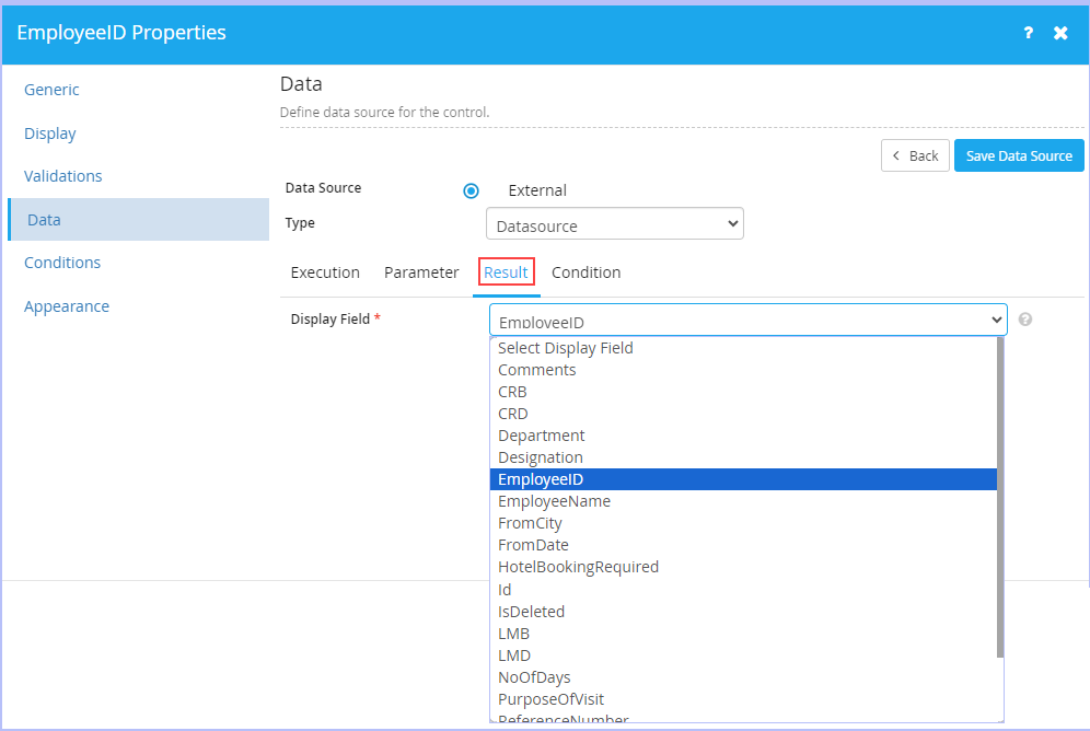
- In the Condition section, specify the conditions as you wish to. Click Save Data Source to save the settings done.

6. Click the Conditions tab. Set how the control should behave contextually in the form to the user. They would be applied in the order in which they are listed. For an illustrated example scenario, see Conditions.
- Click Create Condition to add new conditions to the control.
- On the Conditions tab, specify the conditions as required for the control. Click to add the condition(s) specified.
- On the Conditions tab, specify the conditions as required for the control. Click

- Navigate to the Actions tab. click what the corresponding actions should be, based on the conditions set for the control for the Visibility, Readonly & Mandatory parameters.
- Select the Update value check box to specify the actions based on Value, Fields & Functions as required.
- Click Save Condition to save the condition entries made. You can add any number of conditions for the control.
- Click Back to navigate back to the previous dialog box, if you want to set the conditions afresh.

7. Click the Appearance tab. Set the various basic & advanced properties for both the form control & its associated label.
- On the Control tab, you can set basic control properties such as General (Alignment, Width & Background), Border (Color, Width & Style), Font (Family, Size, Color & Style) & Margin (Top, Bottom, Right & Left) as required. Click Advanced & set advanced control properties (In CSS Code Format) as required. Click Reset to clear the existing settings made & set afresh again

- Similarly, you can set both basic & advanced control properties associated to a label on the Label tab as required.

8. Click Apply.
|
|
| Since setting the properties of various form controls is more or less similar as described earlier, only setting a specific property of a selected form control (matching our sample example for the ease of understanding) is detailed below. |
| To set or change properties of a selected form control, follow these steps: (in this case, a Radio button control) |
1. Click theicon which appears on the far right side of the form control selected, Hotel Booking Required (a Radio button control) as shown.

2. The following form control Properties dialog box appears with Generic tab as default.

- On the Generic tab, edit the display name of form control as appropriate in the Display Name box. Observe that Model Attribute Name & Data Type fields are greyed out and cannot be modified once set (since our form is based on a defined transaction data model). The Dependency field lists the name of other dependent form controls, if any.
3. Click the Display tab. Select the Inline check box as shown. This setting ensures that the radio button control options are displayed inline (side by side) rather than one after the other.

4. Click the Validations tab. Set the basic & advanced data validation settings as shown.

- On the Advanced tab, set the validation inputs as you wish to & click Save Validation to save the validation entries made.
- Click Back to navigate back to the previous dialog box, if you want to set the validation parameters for the control afresh.
5. Click the Data tab. Set the type of the data source for the control as shown.
- Click Built-in as the Data Source type & key in the values in the Display and Value fields.
- Click to add them.

Notice that the option 'No' is set as default value.
For the step by step description on both the Conditions & Appearance tabs, please refer the steps 6 & 7 (Setting Form Control Properties section above).
6. Click Apply.
| Previous | Back to Contents | Next
Conditions >> |
Conditions
In the above sample 'Travel Requisition Form - Employee', if you wish the value in 'No Of Days' field to be calculated automatically & displayed based on the date values in 'From Date' and 'To Date' fields, then you have to set the 'No Of Days' text box form control properties in a sequential manner as shown.


Notice the display of various available Intrinsic functions (such as Arithmetic functions, Math functions, String functions, Date & Time functions etc.,) for this form control having its data type defined as 'String'. These functions vary based on the data type of the form control.

Note that you can add an additional parameter as well as remove the existing parameter.
- Click Save Condition to save the specific entries made. Else, click Back to navigate back to the previous dialog box, if you want to set the conditions afresh.
- On saving the condition, the following screen appears. Click Apply.

|
You can add any number of conditions. The conditions are applied in the order in which they are listed on this screen. In addition, you can edit or delete defined conditions any time as well. |
| Previous | Back to Contents | Next |
Toolbar Options
| To | Action | |
| Save Form | Click  |
|
| Save and Publish Form | Click  |
|
| Import Model Attributes [to add to Form] | Click  |
|
| Import Forms | Click  |
|
| Edit Current Form | Click |
|
| Clear Form | Click  |
|
| View Form in Full Screen | Click  |
|
| View Form Log | Click  |
|
| Set Form Properties | Click  |
|
| Preview Form | Click  |
|
| Go Back to Form Design Mode | Click  |
|
| Previous
<< Conditions |
Back to Contents | Next |
Setting Form Properties
|
Form Designer allows you to set few generic properties of a form through the Form Properties dialog box. However, it provides plenty of options to set or modify properties related to each & every form control available in it. |
| To set Form properties, follow these steps: |
1. Open the requisite form for which you wish to set properties for. Click .
2. The Form Properties dialog box appears.
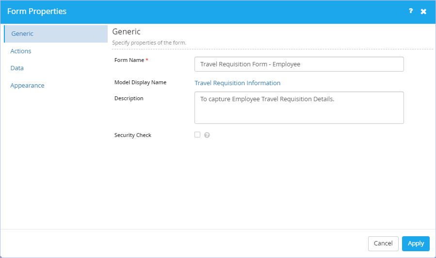
3. Click the Generic tab. Set the generic properties of the form.
- Modify the form name as you wish in the Form Name box.
- Enter or modify the form description as appropriate in the Description box.
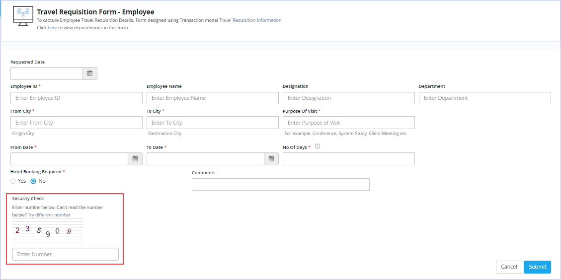
- Select the Security Check check box, if you wish to provide CAPTCHA (Completely Automated Public Turing Test to Tell Computers and Humans Apart) feature as an additional layer of security for the form.
Following is a preview of the 'Travel Requisition Form - Employee' with Security Check check box enabled.
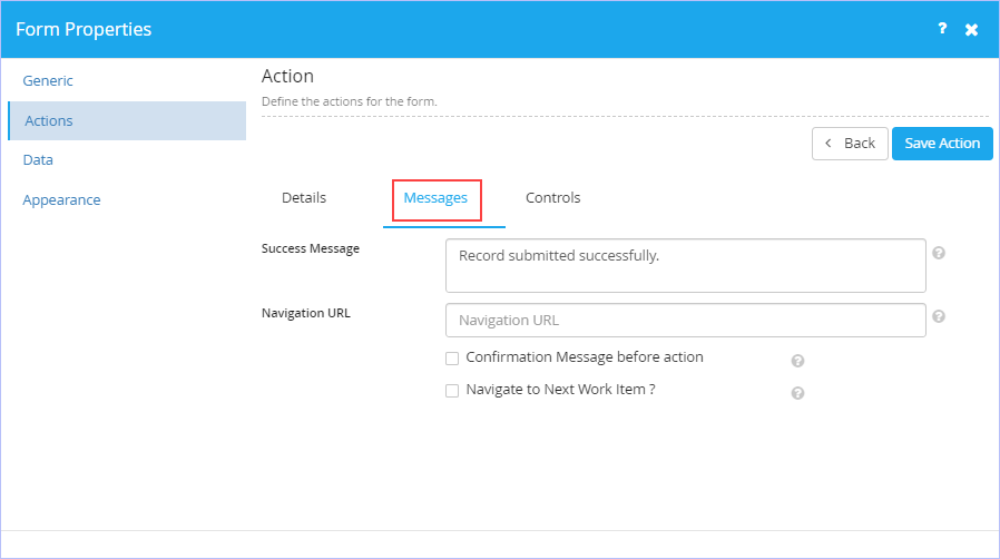
4. Click the Actions tab. Define the actions for the form. Observe that two actions in the form of 'Submit' & 'Cancel' representing the actions 'Submitting the form data' & 'Returning to the previous page' are displayed by default. Based on your form design requirements, you can either modify these default action names or delete them altogether & add your own newly defined actions afresh.

- Click Create Action if you wish to add your own newly defined action for the form.
- On the Details tab, enter the name of the new action you wish to define in the Name box.
Enter an appropriate description of the defined action in the Description box.
- Select the type of action you wish to associate to the defined action from the Action Type list. The options available are: Submit form data, Reset form data, Ignore current form & Save as Draft. If the selected option is Submit form data, then you can select whether the defined action is primary or not from the Primary Action check box. A Form must have one primary action and controls mapped for the primary action are displayed the mandatory symbols.
- Choose the Alignment options as required. By default, Right option is selected.

- Navigate to Messages tab. Key in an appropriate message in the Success Message box. This message is displayed during the submission of the form. Please note that the form success message concatenates with the reference number in case of process form.
- Enter a valid navigation URL to navigate to when this action is performed in the Navigation URL box.
- Select the 'Confirmation Message before action' check box, if you wish to provide a confirmation message before the action of button.
-
Select the ‘Navigate to Next Work Item?’ check box, if you wish to navigate to the next work item (In the event of the work item being assigned to a user in workflow).
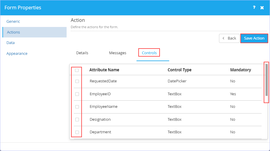
- Navigate to Controls tab. Select the Attribute names (check boxes) associated to the controls you wish to make as mandatory for the defined action as needed.
- Click Save Action to save the entries made.
- Click Back to navigate back to the previous dialog box, if you want to define the actions afresh.
5. Click the Data tab.
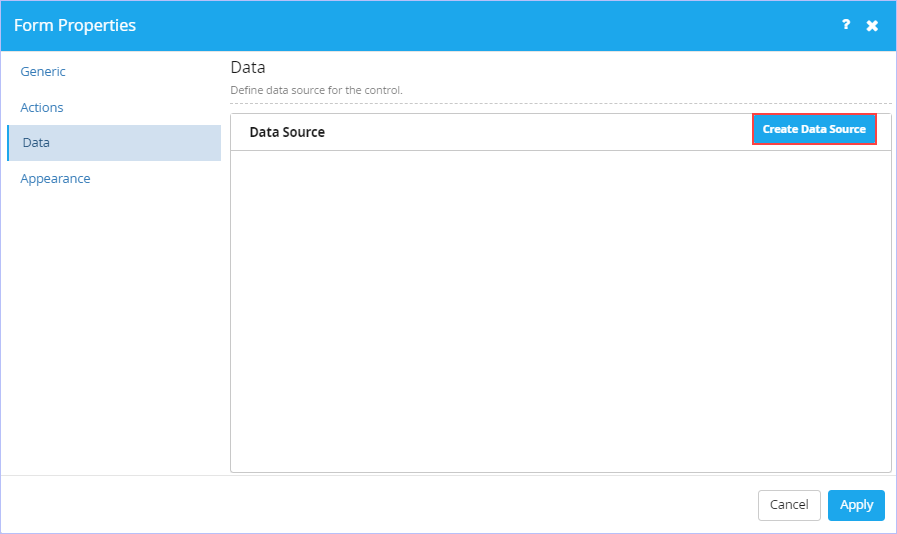
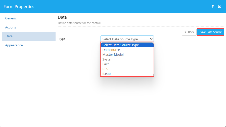
- Click Create Data Source. Set the type of the data source at the form level as required.
Select the type of data source from the Type list. The available options are: Datasource, Master Model, System, Fact, REST & iLeap.
Specify the values as required in their respective sections displayed (Execution, Parameter Result & Condition). For details, see Data tab (Form Control Properties - Details). Please note that the options vary based on the type of Data Source selected.
- Click Save Data Source to save the changes made.
6. Click the Appearance tab. Set the various properties (Form Layout Style & Control Style) related to the appearance of a form as you wish.
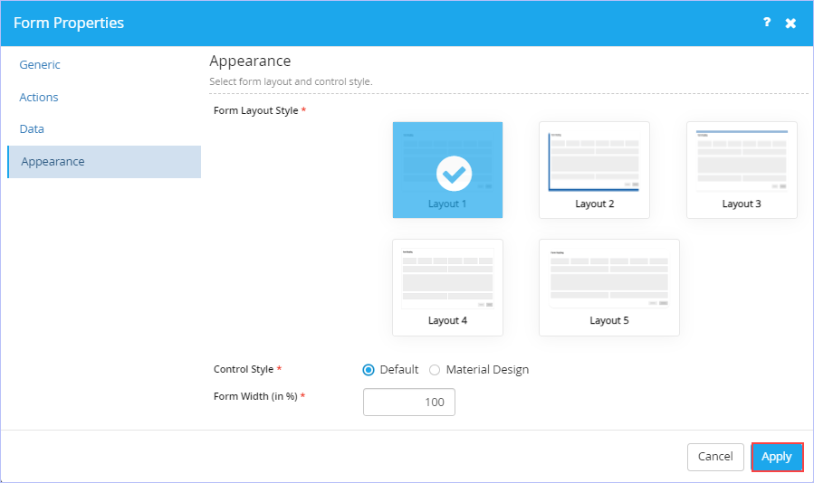
-
Click on any of the available Form Layout Style you wish to apply for the form.
Click the type of Control Style you wish to. You can choose either Default or Material Design.
-
Enter the Width of the Form you wish to in the Form Width(in %) box.
7. Click Apply to apply the selections made.
| Previous | Back to Contents | Next |
Editing a Transaction Model Form
|
You can edit a form at any time even after its publication as well. |
| To edit a published form, follow these steps: |
1. On the Forms tab, hover the mouse pointer on any published transaction model form & click . Alternatively, open any published master model form you wish to edit & click on the toolbar to edit it.
2. Make the requisite modifications & then save or publish the form as needed.
| Previous | Back to Contents | Next |
Deleting a Transaction Model Form
|
Any form once published cannot be deleted either. However, it can only be deleted in its draft/editable state before being published. |
| To delete a transaction model form, follow these steps: |
1. Hover on any unpublished form (in draft state) you wish to delete. Click the icon to discard it.
2. A confirmation message prompts you to choose an option between Yes or No to delete the draft version. Click Yes. On successful deletion, 'Success! Form deleted successfully.' message appears.
| Previous | Back to Contents | Next
Layouts >> |
Layouts
| A Layout plays a significant role in any form design. It refers to the arrangement of elements on a form usually referring to specific placement of images, text, & style.
Form Designer provides the following four intuitive & visually appealing layouts that can be used to design rich forms (in addition to One, two, three, four & six column layouts). You can design visually appealing & dynamic forms to suite your business needs swiftly & easily by setting their properties appropriately. |
| Previous | Back to Contents | Next |
Setting Layout Properties
|
We will illustrate how to set the properties for each of these layouts. You can easily customize the settings to meet your specific business requirements. |
Tab Layout
| Tabs are used to logically group controls in a form, but provide better utilization of horizontal space as compared to a Panel Layout. There can be up to 10 tabs in a single Tab Layout. You can insert a Layout in a Tab, but not vice versa. |
| To set the Tab Layout properties in any form, follow these steps: |
1. Within any form, drag the Tab Layout form control from the left pane (under Layouts menu) & drop it on to the right side of the canvas area as shown.

2. Click  . The Tab Properties dialog box appears.

- On the Generic tab, specify the generic properties for the Tab Layout.
- The Horizontal check box is selected by default indicating the display of tabs horizontally to the user. Clear this check box, if you wish to display the tabs vertically.
- Select the Enable Navigation check box if you to navigate between the tabs within the Tab Layout.
- Click on the Tab1 row & enter its display name & description as appropriate (for example, Customer Details & Customer Details - Global). Click
 to update the entries made.
 - Similarly, repeat it for Tab2 row as well as shown. Click
 to cancel the update made.

-
Click
 against any Tab row you wish to select it to be displayed as default.
 - Once done, click Apply.

- Alternatively, you can enter the display name of your tab along with its description first instead of updating the built-in Tab fields. In this case, click to add the tab first.
| Following screenshot shows a sample "Preview" of a real-world scenario showing usage of Tab Layout (Horizontal) with few form controls embedded in Forms.
Other configurations set on this sample Tab Layout:
|

| Previous
<< Layouts |
Back to Contents | Next |
Repeater Layout
| This form layout control is used to create a predefined row of controls to collect multiple inputs from the user. While using the form, users can add as many rows as required. A numeric column in the grid can also be used to perform simple arithmetic operations to provide summary data for that column. |
| To set the Repeater Layout properties, follow these steps: |
1. Within any form, drag the Repeater Layout form control from the left pane (under Layouts menu) & drop it on to the right side of the canvas area as shown.

2. Click . The Repeater Header Name Properties dialog box appears.

- On the Generic tab, specify the generic information of the Repeater Layout.
- Key in the name for the repeater you wish to give in the Repeater Name box.
- Enter an appropriate name for the Parent or Root node required for XML generation in the Root Node box.
- Enter an appropriate name for the Child node required for XML generation in the Child Node box.
- Select the type of display from the Display Type list. The available options are: Table, Repeater & Custom. If Custom display type is selected, then key in the Custom Layout Name in the Layout Name box that appears.
- Navigate to the Display tab. Set the display or appearance configuration of the Repeater.
- Key in the name for the Repeater Header in the Header box.
- Enter the appropriate add & edit captions in their respective Add Caption & Edit Caption boxes.
- Key in the Records Per Page you wish to display in the Records Per Page box. The Range should be between 1 & 100. Default is 50.
- Key in the help content you wish to provide for the Repeater to the user in the Help box.

- Navigate to the Permissions tab. Set how you want your users to perform actions using the Repeater Layout.
- All the three key actions (Add, Delete, & Update) by selected by default. You can retain or clear the respective action check boxes as you wish. (You can add rows to the repeater and can edit or delete the added row, if Add action is selected; can delete previously added rows from the repeater, if Delete action is selected while you can update previously added rows of the repeater, if Update action is selected).
- Click Copy from Excel check box, if you wish the user to copy the bulk data from MS-Excel into Repeater at both App & Inbox levels.

- Navigate to the Table Settings tab. Set the column order, width & visibility of the columns as required.
- Select the Custom Width check box to key in & set the width of the columns in % as required. You can also hide the requisite column you wish to by selecting it. Please note that you must have the form controls [columns] defined in your Repeater layout to configure the settings on this tab.

- Navigate to the Summary tab. Specify the column which needs to display the summary of the column.
- Select the Repeater Column from the Columns list. All the defined Repeater Columns appear in this list.
- Select the corresponding function from the Function list. The available options are: Sum, Average and Concat.
- Select the form field from the Copy To Field list.
- Click Add to add the summary.

- Navigate to the Validations tab. Set the validation parameters for having minimum & maximum rows in Repeater.
- On the Basic tab, Select the minimum number of rows you wish to provide in the Minimum Rows box along with the appropriate validation message that must be shown in the Validation Message box.
- Select an appropriate field from the Minimum Rows(From Field) list.
- Select the maximum number of rows you wish to provide in the Maximum Rows box along with the appropriate validation message that must be shown in its corresponding Validation Message box. (Maximum Rows is 500)
- Select an appropriate field from the Maximum Rows(From Field) list.
- Clear the Validate Data check box if you wish to. This check box is selected by default to validate the Repeater data.

- Navigate to the Advanced tab. click to add new data validation for the layout control. Set the validation parameters including boolean expressions along with an appropriate validation message for the layout control as required.
- Set the validation parameters with boolean expressions as required. Click Create Validation to add them. The expression defined appears in the Expression box.
- Enter an appropriate validation message for the control as required in the Message box.
- Click Save Validation to save the validation entries made.
- Click Back to navigate back to the previous dialog box if you want to set the validation parameters for the control afresh. For details, see Validation tab description in the above Form Control Properties - Details section.
- Navigate to the Data tab. Specify the type of data source for the Repeater.
- Click the type of binding you wish to bind your data source with the Repeater control at run-time. The available options are: External (default) & Lookup. Click Lookup, if you wish to search & select the data source item at run-time.
- Select the type of data source from the Type list. The available options are: Datasource, Master Model, System,Fact, Web Service and REST.
- Specify the values as required in their respective sections displayed (Execution, Parameter & Result). For details, see Data tab (Form Control Properties - Details).
- Click Apply.
| Following screenshot shows a sample "Preview" of a real-world scenario showing usage of Repeater Layout.
The |
 icon in the first preview screenshot denotes the repeater layout elements getting added via a new row as shown in the second preview screenshot.


| Previous
<< Tab Layout |
Back to Contents | Next
Panel Layout >> |
Panel Layout
| Panels are used to logically group controls in a form, but provide better utilization of vertical space as compared to a Tab Layout. You can insert a Layout in a Panel, but not vice versa. |
| To set the Panel Layout properties, follow these steps: |
1. Within any form, drag the Panel Layout form control from the left pane (under Layouts menu) & drop it on to the right side of the canvas area as shown.

2. Click . The Panel title Properties dialog box appears.

- On the Generic tab, specify the generic information of the Panel.
- Key in the header title for the panel you wish to give in the Header box.
- Panel is set to collapsible state by default. Clear the Collapsible check box, if you do not wish to.
- Select the Default to Collapsed check box, if you wish to set the panel appear collapsible by default. This option is greyed out or unavailable for selection, if the Collapsible check box is not selected.
- Navigate to the Condition tab. Set how the control should behave contextually in the form to the user. They would be applied in the order in which they are listed.
- Click Create Condition to add new conditions to the control.
- On the Conditions tab, specify the conditions as required for the control. Click to add the condition(s) specified.

- On the Conditions tab, specify the conditions as required for the control. Click
- Navigate to the Actions tab. click what the corresponding actions should be, based on the conditions set for the control.
- Select the Hide check box if you wish to.
- Select the Readonly check box if you wish to.
- Click Save Condition to save the condition entries made. You can add any number of conditions for the control.
- Click Back to navigate back to the previous dialog box, if you want to set the conditions afresh.

- Navigate to the Appearance tab. Set the various associated properties related to the appearance of the Panel.
- Under the Layout section, click the area in the Background Color box & select a background color you wish for the panel from the Color palette that appears.
- Click the area in the Title Font Color box & select a font color you wish for the Panel Title from the Color palette that appears.
- Select the Title Font Style as required from the Bold, Italics, & Underline check box options.
- Select the alignment of the Panel Title from the Title Alignment box. The available options are: Left, Right & Center.
- Select the Panel Title font from the Title Font list. The available options are: Open Sans Regular, Arial, Arial Black, Comic Sans MS, Courier Sans MS, Impact, Tahoma, Times New Roman, & Verdana.

| Following screenshot shows a sample "Preview" of a real-world scenario showing usage of Panel Layout with few form controls embedded in Forms. |

| Previous | Back to Contents | Next |
Wizard Layout
| This form layout control or design pattern is used to provide guided navigation inside a form. It represents a multi-step form showing one step at a time. Use this design, if you wish to show a single form in various pages as required. For example, you can use this form layout when you want to capture mandatory information in a form while guiding users step by step. When you use this layout, a user moves to the next step only after the current step is complete. This layout is often used wherever you need the user to follow sequential steps. |
| To set the Wizard Layout properties, follow these steps: |
1. Within any form, drag the Wizard Layout form control from the left pane (under Layouts menu) & drop it on to the right side of the canvas area as shown.

2. Click . The Wizard Properties dialog box appears. Notice that you can define a maximum of 15 pages here. A couple of pages (Page1 & Page2) appear by default. Notice that you can set the properties of these pages as well.

- On the Generic tab, specify the generic properties for the Wizard Layout.
- Click on the Page1 row & enter its display name (mandatory) & description as appropriate. Click to update the entries made.
- Similarly, repeat it for Page2 row as well as shown. Click to cancel the update made.
- The Page Type check box is selected by default indicating the display in Page form at a high level. Clear this check box, if you wish to have any sub pages under the Main page.
- Click to add a new page if you wish to. You can add a maximum of 15 pages only.
- Click against any Page row you wish to select it to be displayed as default.
- Once done, click Apply.
Setting the Page Properties of a Wizard Layout:
- Click the icon associated with the Page to set its properties (For example, Page 1).
- The corresponding Properties dialog box appears.

- On the Generic tab, notice that the Page Name and Page Description fields are populated already (retrieved from the Wizard Properties dialog box) and in read-only mode. However, you can choose to hide this page if you wish to. Click Hide Page check box to hide this page on the wizard at run time.
- Navigate to Condition tab. You can define the contextual behavior of controls in terms of conditions & actions in the form.
- Set & define the conditional expressions as required on both the Conditions and Actions tab.
- Click Save Condition to save the entries made.

- Click Apply.
|
|
| Following screenshots show a sample "Preview" of a real-world scenario showing usage of Wizard Layout. |
Design View:


| Previous
<< Panel Layout |
Back to Contents | Next |
Intrinsic Functions
| Following table lists the various types of Intrinsic functions available in Form Designer. |
| Math Functions | Arithmetic Functions | String Functions | Date Functions | Time Functions | Conversion | Built-In Functions | Logical Functions | |
| Absolute | Addition | Concat | Add Days | Add Hours | ToString | Simple Interest | IsEmpty | |
| Arccosine | Subtraction | IndexOf | Add Years | Add Minutes | ToNumber | Compound Interest | ||
| Asin | Multiplication | Slice | Subtract Days | Add Seconds | ToDouble | Asset Depreciation | ||
| Atan | Division | Substring | Subtract Months | Subtract Hours | ToDate | Discount | ||
| Ceil | Modulus | Replace | Subtract Years | Subtract Minutes | ToBoolean | Body Mass Index | ||
| Cosine | ToUpperCase | Current Date | Subtract Seconds | ToTime | GetFieldText | |||
| Exp | ToLowerCase | Day Difference | Time Difference | NumberToWord | GenerateGridSlNo | |||
| Floor | Month Difference | Current Time | DoubleToWord | |||||
| Logarithm | Year Difference | Get Hour | ||||||
| Minimum | Get Date | Get Minutes | ||||||
| Maximum | Get Month Number | Get Seconds | ||||||
| PI | Month Difference Absolute | Time Format | ||||||
| Power | Get Year | |||||||
| Round | DayOfWeek | |||||||
| Sine | WeekOftheYear | |||||||
| Square Root | DayOftheYear | |||||||
| Tangent | QuarterOftheYear | |||||||
| DaysInMonth | ||||||||
| GetMonthName | ||||||||
|
|
GetDayName | |||||||
| Following table lists few key Intrinsic functions with their syntax & usage details: |
|
Function Name |
Syntax |
Description |
Example (Result) |
| Absolute |
Absolute(Integer Value) where the number corresponds to the field or functions which returns integer output |
Returns the absolute value of a number | Absolute(-5) = 5; |
| Ciel |
Ciel(Integer Value) where the number corresponds to the field or functions which returns integer output |
Rounds a number to the nearest integer of equal or greater value | Ciel(3.1415) = 4 ; |
| Floor |
Floor(Integer Value) where the number corresponds to the field or functions which returns integer output |
Rounds a number to the nearest integer of equal or lesser value |
Floor(3.1415) = 3; Floor(2.31) = 2 ; |
| Power |
Power(Base Value, Exponent Value) where Base Value & Exponent Value corresponds to their respective integer values |
Calculates the exponent of a number to a specified power | Power(4,3) = 4*4*4=64; |
| Round |
Round(Integer Value) where Base Value & Exponent Value corresponds to their respective integer values |
Rounds a number to the nearest integer |
Round(3.5) = 4; Round(3.49) = 3; Note: 3.49 will be rounded down, 3.5 will be rounded up. |
| Concat | Concat(String Value, String Value) | Used to Join two or more strings. This function does not change the existing strings, but returns a new string containing the text of the joined strings | Concat(Intellileap, Solutions) = IntellileapSolutions |
| IndexOf | IndexOf(String Value, Search Value) | Returns the position of the first found occurrence of a specified text in a string | IndexOf(iLeap Platform, t) = 9 |
| Slice | Slice(String Value, Start Index, End Index) | Extracts a part of a string and returns a new string containing the extracted part of the string | Slice(iLeap Platform, 1, 5) = Leap |
| Substring | Substring(String Value, Start Index, End Index) | Extracts the characters from a string, between two specified indices | Substring(iLeap Platform, 2, 4) = ea |
| Replace | Replace(String Value, Search Value, Replace Value) | Searches a string for a specified value, or a regular expression, and returns a new string where the specified values are replaced | Replace(Intellileap, i, y) = Intellyleap |
| ToUpperCase | ToUpperCase(String Value) | Converts a string to uppercase letters | ToUpperCase(First string) = "FIRST STRING" |
| ToLowerCase | ToLowerCase(String Value) | Converts a string to lowercase letters | ToLowerCase(First string) = "first string" |
| Add Days | Add Days(Date Value, Integer Value) | Adds the number of days to the specified date. Returns a valid date & time | Add Days(01/08/2020, 2) = Fri Jan 10 2020 00:00:00 GMT+0530 |
| Add Years | Add Years(Date Value, Integer Value) | Adds the number of years to the specified date. Returns a valid date & time | Add Years(01/08/2020, 4) = Wed Jan 08 2024 00:00:00 GMT+0530 |
| Subtract Days | Subtract Days(Date Value, Integer Value) | Subtracts the number of days to the date. Returns a valid date & time | Subtract Days(02/05/2020, 5) = Fri Jan 31 2020 00:00:00 GMT+0530 |
| Current Date | Current Date( ) | Returns the current system date | Current Date( ) = 01/10/2020 |
| Day Difference | Day Difference(Date Value, Date Value) | Returns the difference between the days | Day Difference(02/15/2020, 02/11/2020) = 4 |
| Month Difference | Month Difference(Date Value, Date Value) | Returns the difference between the Months | Month Difference(Date Value, Date Value) |
| Get Date | Get Date(Date Value) | Returns the date in MM/DD/YYYY format | Get Date(01/10/2020 ) = 01/10/2020 |
| Get Month Number | GetMonthNumber(Date Value) | Returns the month number of the specified date | GetMonthNumber(02/10/2020) = 2 |
| Add Hours | Add Hours(Time Value, Integer Value) | Adds the number of hours to the specified time. Returns a valid time | Add Hours(14:00, 2) = 16:00 |
| Subtract Hours | Subtract Hours(Time Value, Integer Value) | Subtracts the number of hours to the specified time. Returns a valid time | Subtract Hours(12:30, 4 ) = 8.30 |
| Time Difference | Time Difference(Time Value, Time Value) | Returns the time in milliseconds | Time Difference(4:00, 3:00) = 3600 |
| Current Time | Current Time( ) | Returns the current system time | Current Time( ) = 15:55 |
| Get Hour | Get Hour(in Milliseconds) | Returns the total no. of hours in milliseconds | Get Hour(72000) = 2 |
| Time Format | Time Format(Time Value) | Returns the time in hh:mm:ss format | Time Format(72000) = 02:00:00 |
| Addition | Addition(Integer Value, Integer Value) | Returns the sum of two or more numbers | Addition(60, 15) = 75 |
| Subtraction | Subtraction(Integer Value, Integer Value) | Returns the difference between two or numbers |
Subtraction(80, 8) = 72 Example: In a Electronic store, a DVD that sells for $80 is marked, "10% off". What is the discount? What is the sale price of the DVD? First, calculate the Discount; Discount = $80 X $0.10 = $8 Now, the Sale Price is calculated as: (List price − Discount = Sale Price) $80 - $8=$72 |
| Multiplication | Multiplication(Integer Value, Integer Value) | Returns the multiplied value of two or more numbers | Multiplication(80, 0.10 ) = 8 (From the above Electronic store example), The Discount is calculated as: (List price X Discount rate = Discount ) $80 X $0.10 = $8 |
| Division | Division(Integer Value, Integer Value) | Returns the repeated subtraction value | Division(8, 80) = 10 (From the above Electronic store example), The Discount rate can be calculated as: (Discount / List price = Discount rate) $8 / $80 = $0.10 |
| Modulus | Modulus(Integer Value, Integer Value) | Returns the remainder after the division of one number by another | Modulus(48, 10) = 8 |
| Simple Interest | Simple Interest(Principal, Interest Rate, Number of years) | Returns the value (Interest amount) based only on the Original Principal | |
| Compound Interest | Compound Interest(Principal, Interest Rate, Number of years, Compounds per year | Returns the value (Interest amount) generated by the sum of the Principal and any accrued interest annually | |
| Asset Depreciation | Asset Depreciation(Cost of the Assets, Rate of depreciation, Number of years) | Returns the depreciated value of the Asset | |
| Discount | Discount(Price, Discount) | Returns the discount amount | |
| Body Mass Index | Body Mass Index(Body weight, Height) | Returns the BMI value |
| Let us take a couple of real world examples to illustrate how these intrinsic functions can be used in iLeap Platform. |
|
Example Scenario 1: John purchases an iPad Mini for $460. if its depreciation is calculated as 5% P.A, what would be the amount/value by which it depreciates over 3 years? First, we will calculate the depreciation value of asset iPad Mini by using the following depreciation formula: A = P(1-R/100)n Where, A = Value of asset iPad Mini after 'n' years P = Initial cost of asset iPad Mini R = Rate of depreciation Per Annum n = Number of years, the asset has been depreciated So, the initial cost of the iPad Mini, P = $460 Rate of depreciation, R = 5 % n=3 Computing the values by using the above depreciation formula, we get: A = $460 (1-5/100)3 = $460 (1-0.05)3 = $460 (0.95)3 A = $394.39 Hence, the depreciation value of the asset iPad Mini, A = $394.39 However, the depreciation amount, D = P-A
So, the depreciation value of the asset iPad Mini over a period of 3 years = $65.60 Now, the above depreciation formula that we used to calculate the depreciation value of the asset can be converted or deduced in iLeap Platform as shown: If (P is Not Blank or R is Not Blank or n is Not Blank) { Hide = false ReadOnly = false Mandatory = false Value = Multiplication(P, Power(Subtraction(1, Division(R,100)),n)) }
Example Scenario 2: If an amount of $5000 is deposited into a savings account at an annual interest rate of 5%, compounded monthly, what will be the value of the investment after 10 years? Here, we use the following formula to calculate the annual compound interest, including the Principal sum: A = P(1 + r/n)(nt) Where, A = the future value of Investment, including Interest P = the Principal Investment Amount (the Initial Deposit amount) r = the annual Interest rate (in decimal) n = the number of times that interest is compounded per year t = the number of years the money is invested for From the above example, P = $5000 r = 5/100 (0.05) n =12 (compounded monthly) t = 10 Therefore, A = $ 5000 ( 1+ 0.05/12) (12(10)) A = $ 8235.05 So, the investment balance after 10 years = $ 8235.05. Now, the above annual compound interest formula we used to calculate the annual compound interest can be converted or deduced in iLeap Platform as shown: If (P is Not Blank and r is Not Blank and n is Not Blank and t is Not Blank ) { Hide = false ReadOnly = false Mandatory = false Value = Multiplication(P,Power(Addition(1,Division(r,n)),Multiplication(n,t))) } |
|
The following section is applicable to iLeap's On-Premises deployment only. |
| Previous | Back to Contents | Next |
Creating a new Custom Form
| Form Designer allows you to create custom forms in a breeze. You can rapidly create your own custom forms that meet your specific business requirements & deploy them efficiently. |
| To create a new custom Form, follow these steps: |
1. On the New Form dialog box, click Custom Form.

2. Click Next. The following dialog box appears.
-
Enter the name of the form in the Form Name box. Ensure to key in a unique form name. For example, CTRF - 1.0.
- Enter an appropriate description for the new form to be created in the Description box.

3. Click Create. The following page appears.

4. Select the type of custom form from the Custom Form Type list. The available options are: Javascript Plugin (default) & Web Application URL. See Custom Form Types for more details.

5. Enter the Javascript Plugin name in the Plugin Name box (name of the custom trigger form). If the custom form type selected is Web application URL, then enter the corresponding URL of the Web Application in the Web Application URL box as appropriate. Notice the display of the source path where the selected custom form type would be available. The custom form type Web Application URL must match with the API input method used to invoke or trigger an instance of a specific process.
6. Choose the level of Form Usage. Click In Process Property (default) to trigger or start the process through the custom form (via an App) else click In Human Task to trigger through your Inbox.
7. Click to Save and Publish the custom form created.
The newly created custom form is shown below:

|
Currently, a custom form cannot be edited. |
| Previous | Back to Contents | Next |
Guidelines for developing trigger custom form
| Listed below are the guidelines to be followed for developing a trigger custom form (folder or location structure to be created for effectively deploying custom forms). |
1. Create a sample custom form folder 'triggertemplate' in the following path as shown. (Here, we have named the custom form folder as 'triggertemplate' as an example for illustration purpose only. It actually should be the name of trigger custom form you wish to develop as per your requirements).

2. Create a sample folder named 'css' under the 'triggertemplate' folder & copy all your css files related to a page you are developing as shown.

3. Create a sample folder named 'templates' under the folder 'triggertemplate' & copy all your css files related to a page you are developing as shown.

4. Create a Java script file 'triggertemplate.js' & copy it in the 'triggertemplate' folder as shown.

|
|
| Previous | Back to Contents | Next |
Guidelines for developing action custom form
| To develop an action custom form that appears in Inbox module, follow these steps: |
1. Create a sample action custom form folder 'actiontemplate' in the following path as shown. (Here, we have named the custom form folder as 'actiontemplate' as an example for illustration purpose only. It actually should be the name of action custom form you wish to develop as per your requirements).

2. Create a sample folder named 'css' under the folder 'actiontemplate' & copy all your css files related to a page you are developing as shown.

3. Create a sample folder named 'templates' under the folder 'actiontemplate' & copy all your css files related to a page you are developing as shown.

4. Create a Java script file 'actiontemplate.js' & copy it in the 'actiontemplate' folder as shown.

|
|
| Previous | Back to Contents | Next |
Viewing the Dependency Details & Usage of the Form
|
Form Designer allows you to view the information related to the usage or dependencies of specific iLeap components such as Process and Models in any Form at any point in time. |
| To view the dependency details & usage of any Form, follow these steps: |
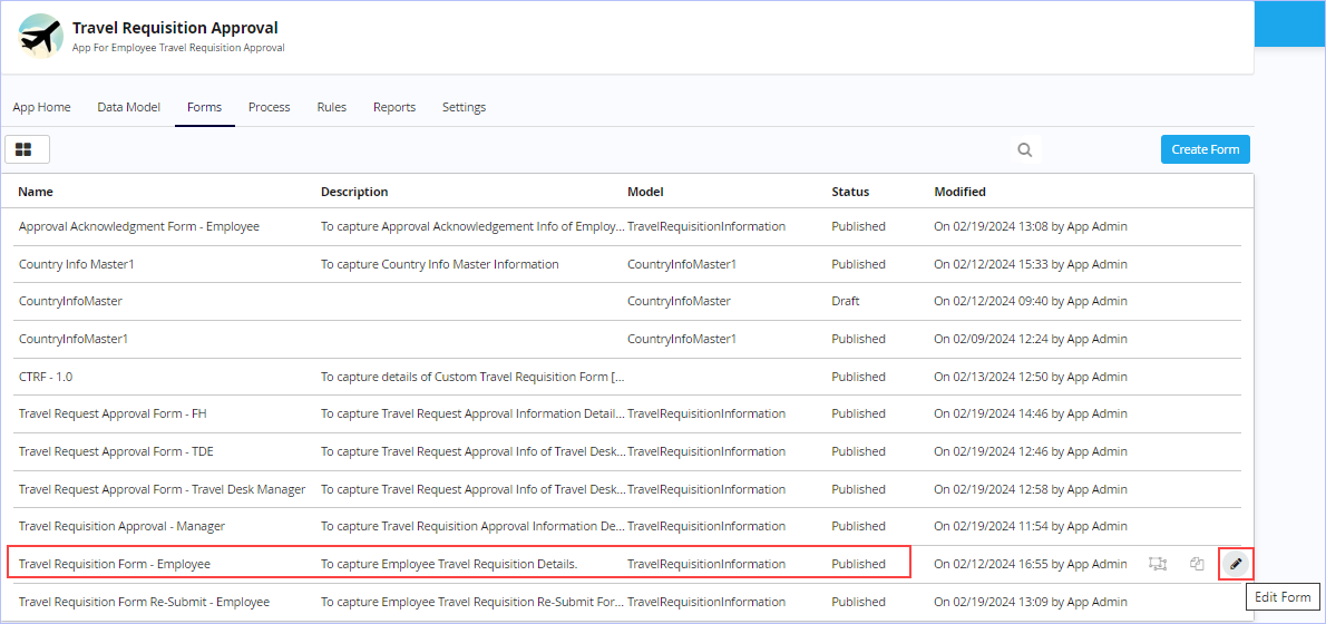
1. On the Forms tab, hover the mouse pointer over the Form you wish to view details & click  .
.
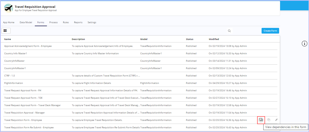
2. The Form Usage dialog box appears.
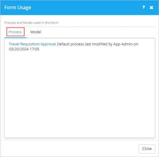
- Notice the display of Process name along with details used in the Form under the Process tab.Click on the displayed process name to instantly view the Process flow diagram associated.
- Navigate to the Model tab to view the model and its details used in the Form.
3. Click Close.
| Previous | Back to Contents | Next |
Creating an Associated Form [Save As]
| Associated forms are basically a replica or child of their Parent forms with few additional fields & properties. In Associated forms, the fields carried over from their Parent forms can be set with different property (visible or read-only etc.). These fields carry same values from previous level (Parent or Peer), but can be over-ridden. |
| To create an associated form, follow these steps: |
1. On the Forms tab, hover the mouse pointer on any published transaction model form for which you wish to create an associated form & click  .
.
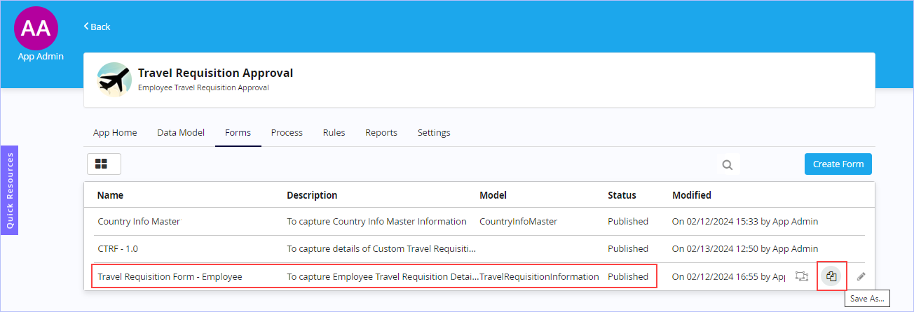
2. The Save As dialog box appears.
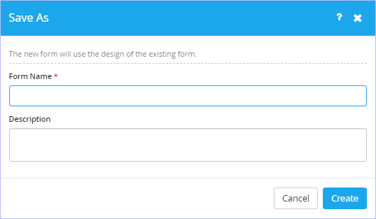
-
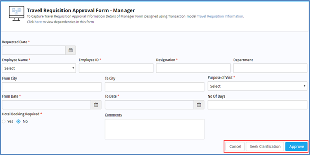
Enter the name of the form in the Form Name box. Ensure to key in relevant form name. For example, 'Travel Requisition Approval Form - Manager '.
- Enter an appropriate description for the new form to be created in the Description box.
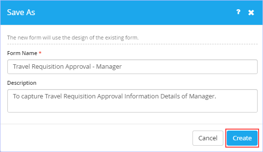
3. Click Create. The following page appears.
Notice that all the model attributes associated with the selected form are imported automatically.
4. You can choose to save or publish the form as per your requirements.
The functional behavior of associated form is same as its parent form(s) which has been discussed earlier. You can modify its properties as per your requirements. |
 to add Import Model Attributes, if you wish to.
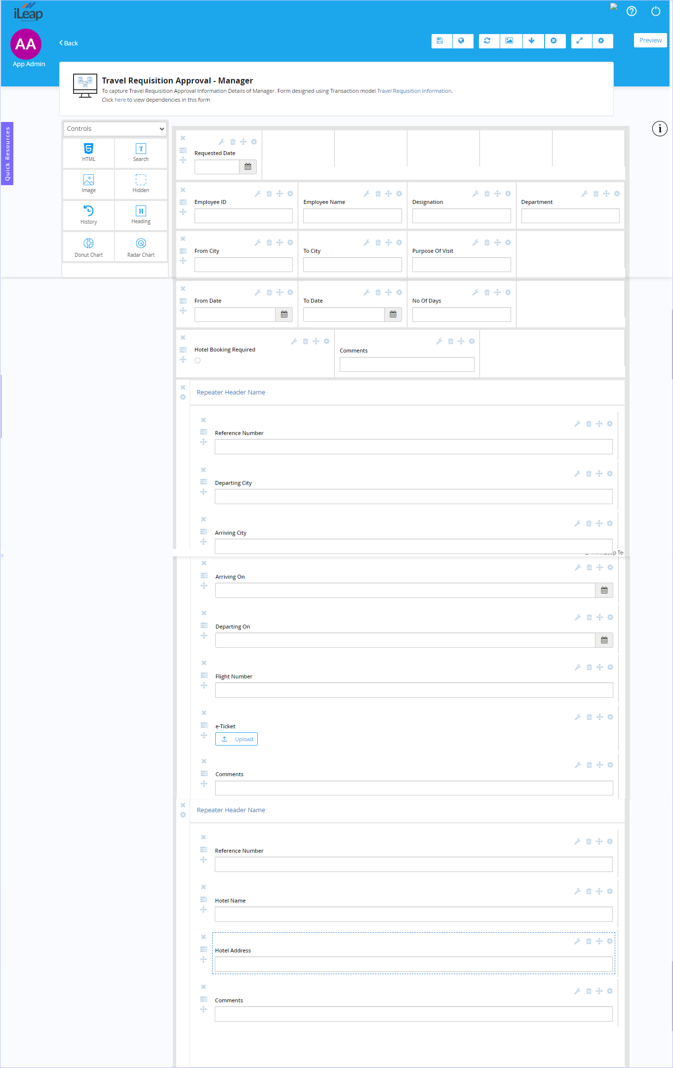
 Preview of the sample 'Travel Requisition Approval Form - Manager' associated action form designed in Form Designer is shown below.
| Previous | Back to Contents | Next |
Form Repository - Preview
|
Preview of all the custom designed forms for the sample Travel Requisition Approval Process App scenario. Master Model Forms:
Preview of Country Info Master Master Model Form:
Transaction Model Forms:
Preview of Travel Requisition Form - Employee [Trigger Form]:
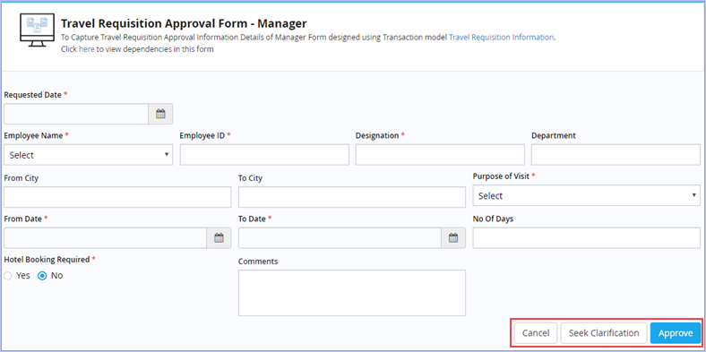
Preview of Travel Requisition Approval Form - Manager [Action Form]:
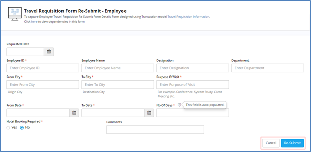
Preview of Travel Requisition Form Re-Submit - Employee [Action Form]:
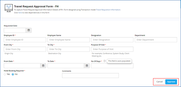
Preview of Travel Requisition Approval Form - FH [Action Form]:
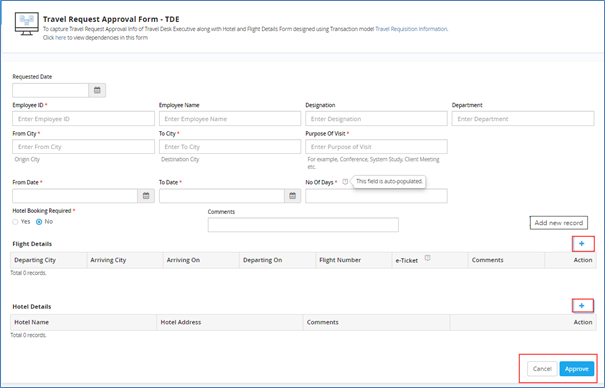
Preview of Travel Request Approval Form - Travel Desk Executive [Action Form]:
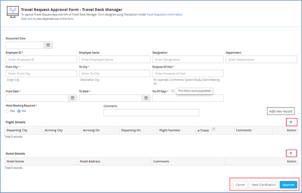
Preview of Travel Request Approval Form - Travel Desk Manager [Action Form]:
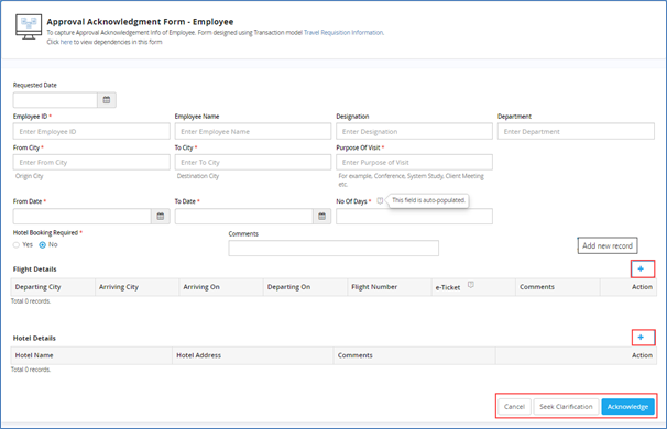
Preview of Approval Acknowledgment Form - Employee [Action Form]:
|

| Previous | Back to Contents |